

Our Tips for Maximizing the Impact of Your Font
How do we read? How do our eyes process the information on the computer screen?
Learning how the brain processes the information we read is the first step to identifying the most appropriate font choice for your packaging. 24 Ways.org details the science behind the way we read.
Understanding the Basic Font Categories
Each individual font contains an emotional connection and tradition. These fonts fall into five categories:
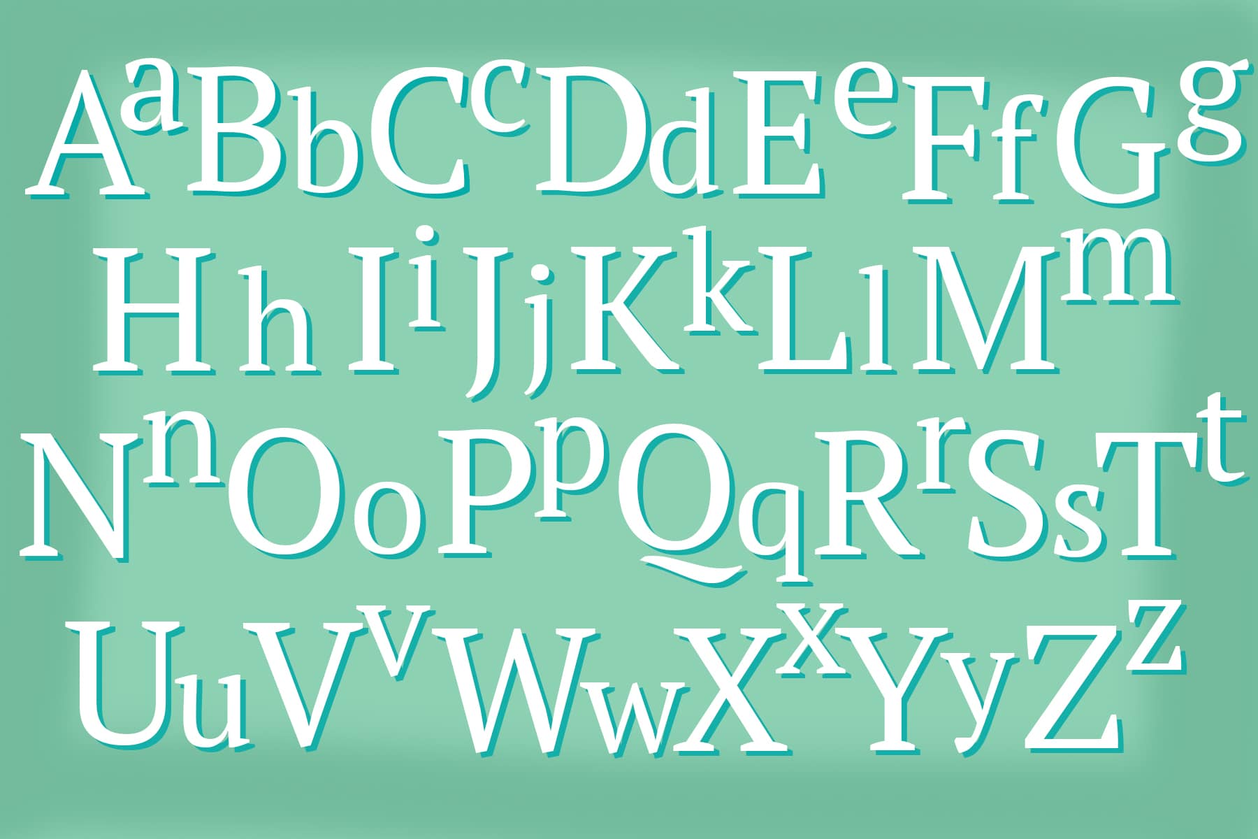
- Serif Fonts: This font choice is your classic look—one that customers easily recognize. A serif, a short line extending off the edge of a letter, is most commonly seen in the print medium. For example, Courier fonts were designed to look like copy originally written on typewriters. Serif fonts are designed to present a classic look on packaging and are the most accessible for customers to read.
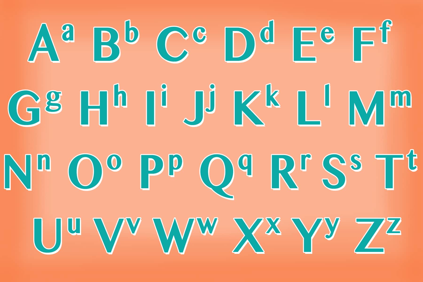
Sans-serif Fonts: This font choice is your modern, clean look. These fonts don’t contain the serifs extending off letters. This style is best suited for digital copy because it is easier to decipher on a low-quality screen resolution. We recommend using Arial and Calibri Sans Serif fonts for your body text on websites to present the most effective copy.
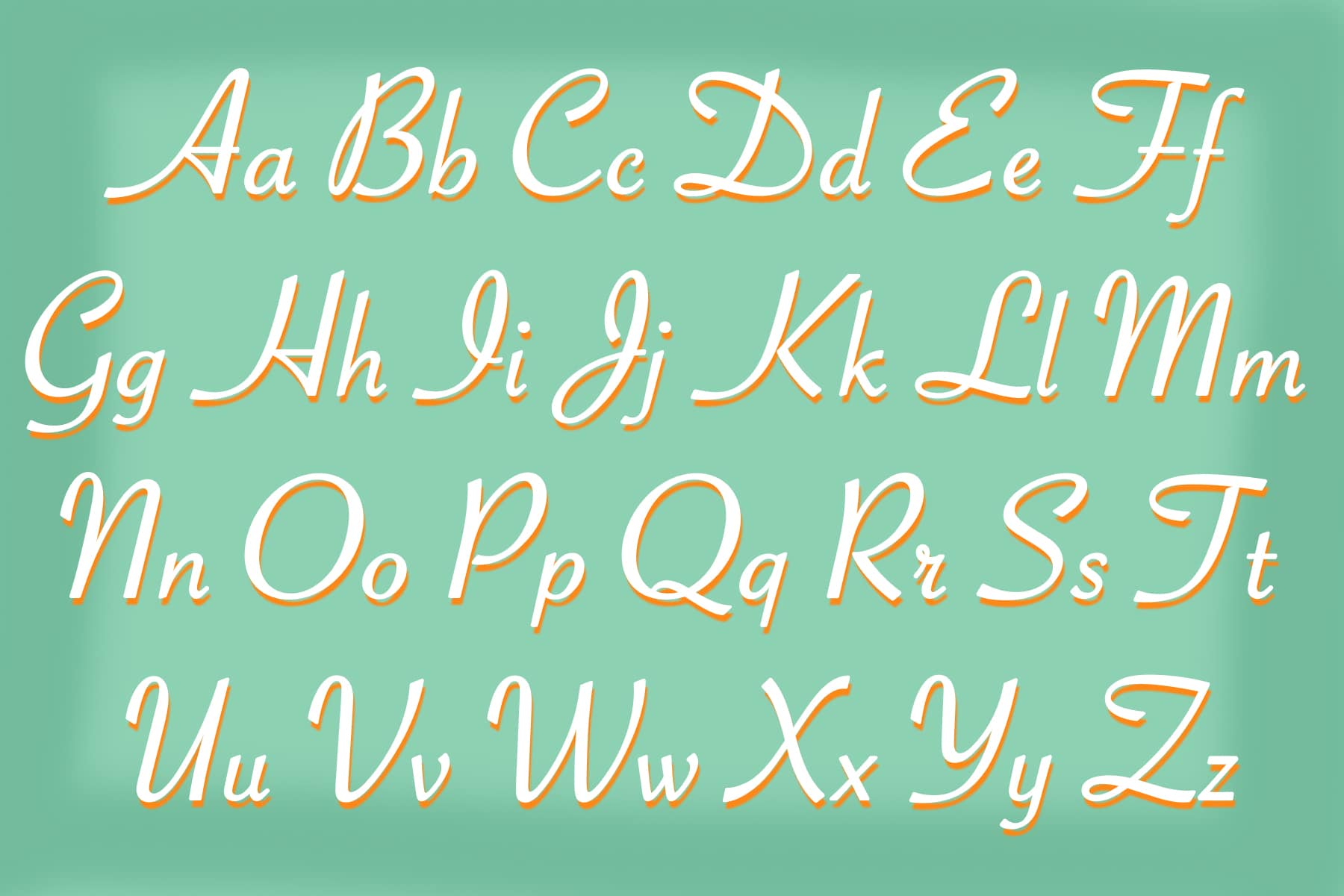
Script Fonts: Many companies prefer using script fonts because they resemble handwriting. Customers feel as though they are receiving something homemade. However, script fonts, while presenting an elaborate design, are more difficult for customers to read on product packaging.
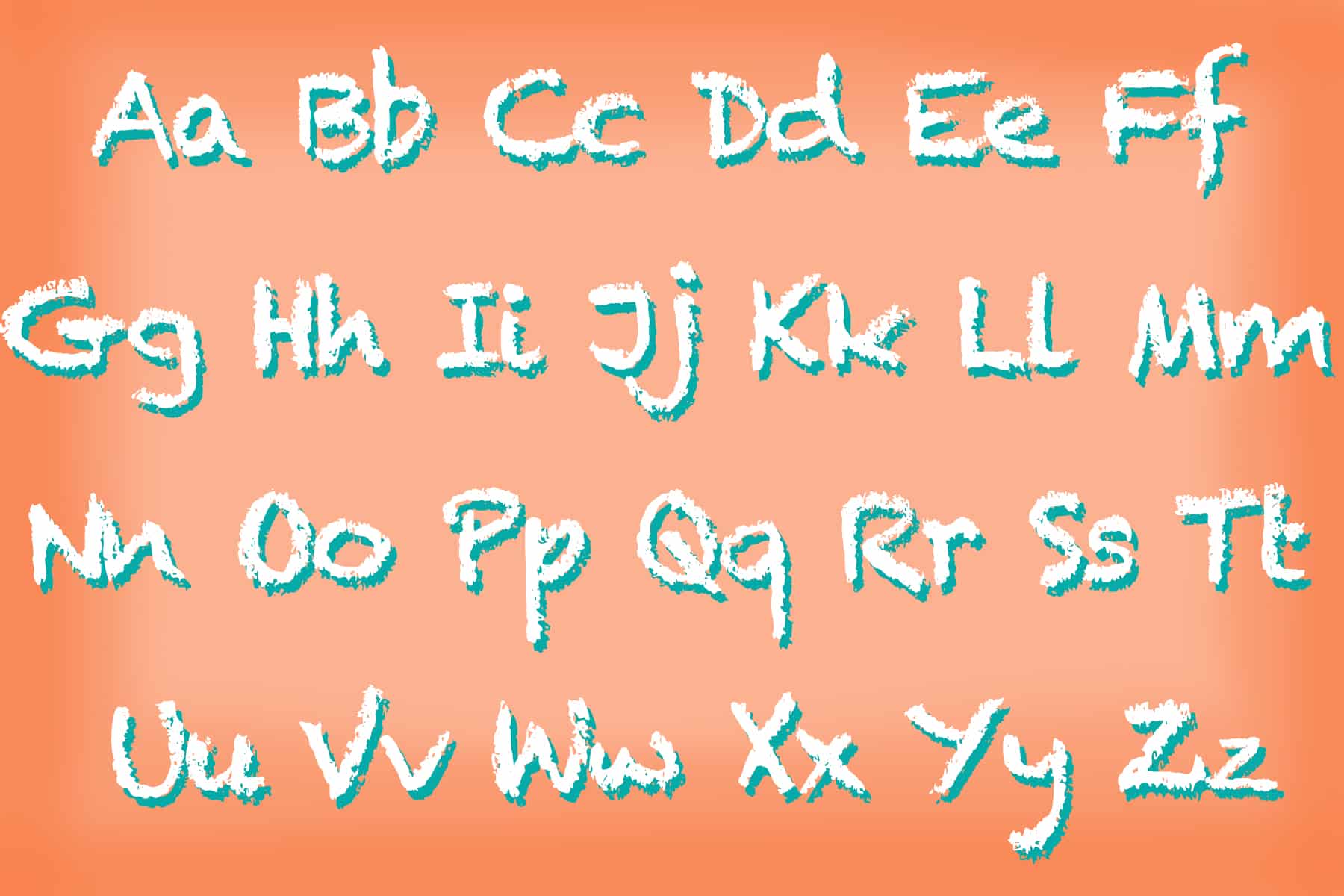
Decorative Fonts: This font choice presents an artistic look. The fonts are best used for headlines and title text, like the logo for your company—a stand-alone text used in small doses. Type takes on a shape, and decorative fonts have an aesthetically appealing and attractive look. The font is designed to grab your customers’ attention.
Comic Sans: Comic sans is, well, comical. There is a debate between designers when, if ever, it is best to use comic sans for your copy. Be prepared before you choose this font for your content

Knowing your goals and options will aid in determining the best font choice for your company’s brand. Packaging needs to have an effective vibe, and the right font choice makes customers feel good, causing them to feel inspired and more likely to take action.
Four Technical Considerations of Font Choice and Your Packaging
1. Number of Fonts
Consider the layout of your design. Customers exposed to a well-designed layout have higher cognitive focus, more efficient mental processes, and a stronger sense of clarity. When designing your packaging, it’s best to consider where you want to place product information, the appropriate font size and how much copy to print. Design experts say that three is the maximum number of fonts you should include on packaging before the copy becomes difficult to read. A 2008 study shows that readers were less perceptive to hard-to-read font rather than fonts that capture their attention and reinforce a brand’s messaging.
2. Size of Font
Today’s trend is to select a bigger font size to elicit a more emotional response from readers. Choosing the right line length (ideally between 50 to 75 characters) and font size (16pt font is the new 12pt font) makes a reader’s experience more enjoyable, encouraging purchases. Will your customers be scanning a shelf to identify words or phrases or will they be holding it in their hand from package delivery? The distance your customers are from your package strongly influences the size of font needed.
The United States Postal Service (USPS) has rules on preferred font choices (Arial, Copperplate, Helvetica, SF Sans Serif, and more) that read best with a 10- to 12-point size. Fonts that can’t be easily scanned by readers can create postal delays your customers won’t appreciate!
And we could write a whole other blog on font choice and FDA. We won’t go there, but if you package food, you should.
3. Font Color and Contrast
For optimal readability, there needs to be contrast in your colors. Black text on a white background (or a light background) is widely known to be the most readable color combination for text. Reverse type is the most difficult to read, but allows you to communicate with color. Be mindful of clients that could be color blind when selecting font color and contast as well.
The Americans with Disabilities Act has rules concerning font: Characters and numbers on signs should be sized according to the viewing distance from which it can be read. The content should contrast the background (light text on a dark background or vice versa). Sans serif or a very simple serif font type is best for reading.
4. Packaging Environment
Many people don’t think about this, but your font choice is also affected by light. Natural light makes colors appear dark and less saturated, therefore it’s best to consider using light, clean colors if your product will be on a shelf with shadows. Artificial light has a completely different effect. Incandescent lighting intensifies warm colors (reds, oranges and yellows), while fluorescent lighting works best with cooler colors (violets, blues and greens). Harsh overhead lighting, however, makes colors appear less saturated. While considering the connection between lighting and your font choices, play around. View color samples and test them out in the various lighting environments your packaging will be in to determine which font choice will work best
Your font choice on your packaging helps to set the vibe for the customer’s experience. With DIY web-based applications like BoxUp empowering business owners to make their own choices on fonts and layout options, it’s helpful to learn a bit about the art and science of font selection.
Designing well-groomed and visually appealing product packaging will further legitimize your company and set it apart from your competitors. Get help now.