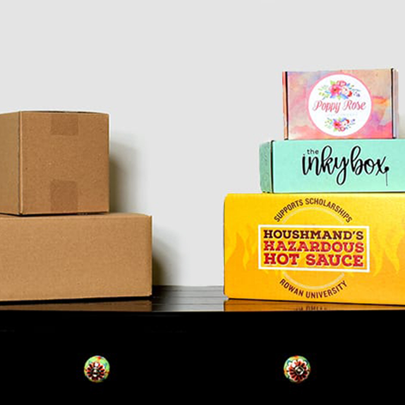
How Can Custom Boxes Make Yours Stand Out?
You’ve found your niche, custom-picked your products and started growing your customer base. You’re hustling for the dream, and the time for owning a subscription service is now. With a booming industry, customers have never had so many options before. You know you’ve got something great to offer, but how do they? When you’re a part of a rapidly expanding industry, it’s not enough to have a product that people want. You need to be visible to your targets, and in this age of choices, a customized package is one of your best tools. To rise above the competition, you need to be prepared to take a creative approach to every detail others might overlook, and when you do your product will stand out from the crowd. BoxUp has seen a lot of boxes come and go, and we’ve got some tips for representing your product with packaging that makes an enticing statement.
1. DON’T follow current color trends (eg, teal, floral prints, etc…).
While it might be chic to stay on trend with popular hashtags and fashion choices, you want your packaging to be bold and different.
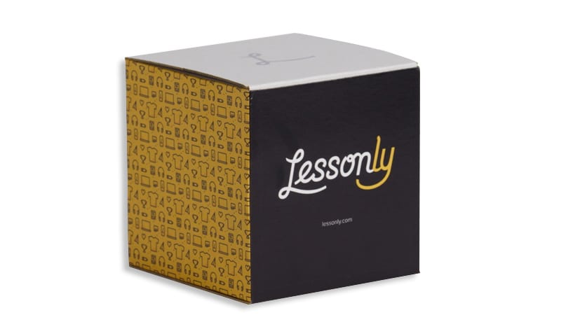
nstead, try using complementary colors, which have a high contrast and catch the eye.
Or, showcase your brand colors! Sticking to a color scheme but altering the details, like with the Nailed It Box, can strike a good balance between diversity and brand consistency. If you don’t have a set color scheme, this is a great opportunity to work on one (and BoxUp can help!). If your brand colors happen to fall under current trends, you don’t have to discard your brand. In fact, staying consistent with your brand is critical. Instead, consider other options that will allow your brand to shine while also highlighting how unique your product is. More on branding below.
2. DON’T use plain black or white boxes.
These scuff easily, and while they may start their journeys pristine and beautiful, there’s certainly no guarantee they’ll arrive on your customers’ doorsteps that way.
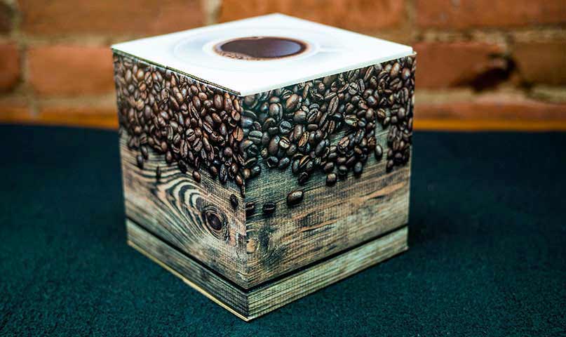
Instead, try textured-type patterns, which can have an organic and/or 3D appeal while also hiding the damage that inevitably happens during transport.
Or, add word art in the form of a quote, long text or interesting font. Troopster, for example, used military creeds in their design. Picking a fun font can add flare, but be careful not to lose legibility!
You can also opt for a limited-time BoxUp or holiday pattern. These options vary in availability with the season, and as such have an exclusivity that will be sure to make them stand out.
3. However, DON’T overdo it.
There’s a limit to how helpful graphics are. Simplicity can stand out, and if you try to put too much on a box the end result will look messy and unprofessional.
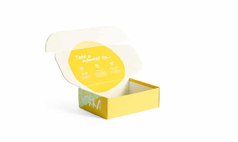
Try instead a single wrap-around image, which can be custom-uploaded. Continuity on packaging holds customers’ attention, and you can be totally unique with limitless options. If you have graphics you absolutely must share but won’t fit, sneak custom printing on the inside of the packaging like in the Ekka Life Box above! Surprise customers with a delightful design on the inside of the box if you find yourself tempted to cram too many things on the outside.
4. DON’T pick a conventional, single-use box pattern.
Quality boxes that immediately go into recycling aren’t meeting their full potential!

Try making your box interactive! Coloring patterns, shooting targets (like Gunner Crate used) and inspirational quotes are just a few of the things you can build into the structure of your box to give it another purpose.
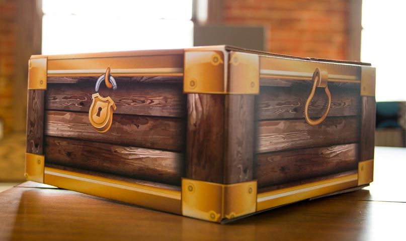
Or, pick a box that doesn’t look like a box. Gabled boxes are one easy example, but you can also design your box to look like a football game, a treasure chest, a school bus or really, anything! This gives these boxes new life as a toy, and the options are endless.
5. Finally, DON’T lose sight of your brand!
With all of these options and ideas, it can be easy to feel overwhelmed. No matter how you decide to make your subscription service stand out, keeping a strong hold on your personal brand is crucial.
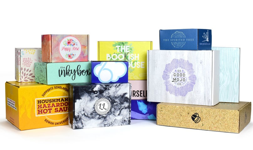
Of course, there is no one-size-fits-all advice for how to best represent every unique subscription out there. By investing some time to cultivate your ideal designs, you can make sure your brand stays strong and stands out in a sea of subscription services. A box is never just a box. Pick and choose among these ideas, find what works best for you and shine on like you were meant to! There’s no better time to get started than today!

