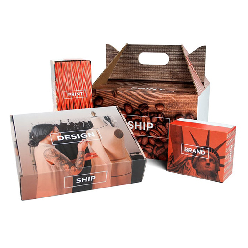
As you begin the design of your own custom-printed boxes, allow us to share some of our experience with a few tips to make a great BoxUp box.
As an intro…what packaging is and what it isn’t
Before we jump into those tips, it’s worth a minute to note a few truths of BoxUp packaging. A BoxUp box could be the first, tangible, hands-on brand interaction between you and your customer. The box also has some other, seemingly obvious functions that are worth a mention. It protects the contents inside, whether it is in processing, in transit or on a shelf. It can provide value-added benefits such as a place for instructions, ingredient listings, storytelling or other messaging. And, of course, the BoxUp box provides something more ethereal – a platform for creating emotion, making a statement or building a brand personality. Using graphic design, imagery and color, your box delivers rational and emotional benefits. To that point, let’s talk about…
Design Aesthetic – what’s your BoxUp package’s vibe?
Your design aesthetic is the sum of its parts. When it’s really working, that sum is greater than the individual parts. Colors, fonts, logos, images and the thoughtful harmony of these elements creates an overall design aesthetic. The aesthetic can be thought of as a vehicle that carries the meaning of your brand over time. In and of itself, it may just be nice to look at, but over time, it can become intertwined with the non-design aspects of your brand – less tangible qualities like ‘reliability’, ‘speed’, ‘accomplishment’ and so on.
It may come naturally to you or you may work with a design professional, but it’s not a bad idea to consider the choices of fonts, logo, color palette and the like, in a thoughtful manner. The style guide of an admired brand like Nike or Apple can, to a degree, be intuited just by looking at their ubiquitous marketing materials and noting the consistent visual choices. For your brand, even a one-page style guide can force you to make decisions and set you on the right track.
Tip 1: ROY G. BIV…CMYK…Red, White and Blue
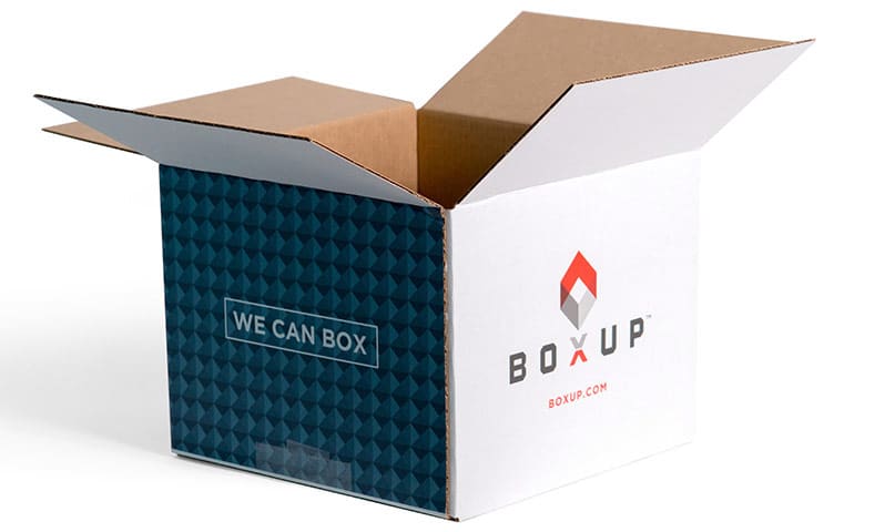
A BoxUp box delivers color. Branded color. Evocative color. The diverse ways colors communicate and work together encompass ‘color theory,’ which we’ve talked about on this site. So, what are some of the impacts of color? A predominant color on your package can denote a product category. For instance, a broad wash of an earthy green color can indicate or support a green message, green contents within, or simply claim your slot in the ‘green/environment/earth-conscious’ category. These color heuristics are not sacrosanct – the rules always rule out the brilliant exception – so you may be tempted to zig when others zag. That can come with its own problems. It is a reactive strategy, after all. So, just be thoughtful and considered in your decision-making on color – whether you’re choosing to go along with the flow or bucking the trend.
How do you know which way to go? Consider a few factors. Is the timing right for something different? Is this a game-changing product, an improvement? Who is the target consumer? What’s relevant to them? Do they have expectations – or an expectation to be surprised? Is the category stagnant? Or does it rely upon certain colors to communicate safety, reliability, approval? These are just a few ideas – a loose framework of a mental exercise as you sketch out your ideas. Don’t hesitate to ask a designer for help if you feel like you’re going to break out in hives making color/design decisions.
If you want help, but have the DIY mindset, seek out the authority of someone like Pantone. The Pantone color matching system is considered the international standard. Two links: Pantone articles. Pantone Complete Color Harmony.
Tip 2: Shake, Rattle and Roll
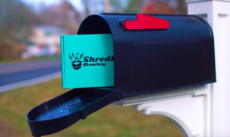
Your box can get mistreated. One thing about the major parcel carriers is this: they are busy and are delivering millions of packages daily. It won’t always be kid-glove treatment. White boxes might get scuffed. A black box might become black and brown. If you’re shipping boxes, it’s worth it to run a few test deliveries to get a sense of how your box ships. A “camouflaging” design trick to reduce the effect of transit wear and tear is to design using color and textures.
Tip 3: Is that a “Cool White” or a “Warm White”?
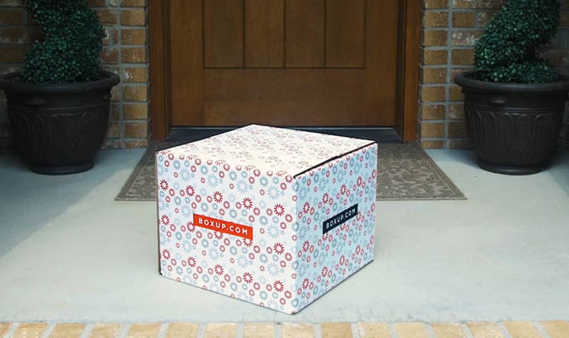
Ink doesn’t live in a vacuum. It’s applied to something. And that something influences how our eye sees it. At BoxUp, we lay ink on a 200 # corrugated cardboard with white paperboard adhered to a B or E flute. The fluting, sturdy but not overly ‘rippled’, offers strength without the heavy, “ribbed” effect you’d see with a larger flute. Thus, your ink lays down smooth. A UV-cure helps set the ink, helping it stand up to the elements and smudges. While clay coating is something you’ll see on some printed boxes, it sends the cost up significantly. We don’t do it. Look at our gallery and you’ll likely come to the same conclusion we did – that the mix of B/E flutes, white paperboard and UV-cure delivers strong color efficiently and affordably.
Tip 4: “Value-Adds.” What Can Your Box Do For You?
Free Toy Inside! Sometimes the outside of the box needs to do more than just tell you the basic contents. It may transfer additional information, an enticement, instructions or nutritional information, just to name a few. The inside of the box can also be a useful surface for branding or exchanging valuable information.
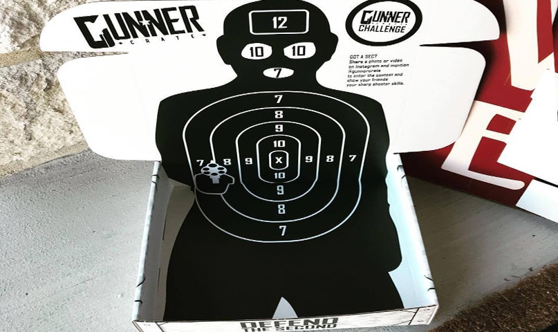
For Gunner Crate, the box is actually a part of the content. Once opened up and posted, it provides a target for his shooting enthusiasts.
What else can the box design do for you? It can improve your efficiency with instructions on the outside (apparel sizes, for instance) for faster kitting and fulfillment practices. It can serve in the role of invitation, offer a new twist on the formal card and envelope tradition. It can add a level of pomp and circumstance to a recognition gift with a message on one of the panels – ex: “10,000 injury-free hours” or “30 Years of Service”. And, of course, the box can be another platform for placement of special URLs, product tutorial codes or whatever comes next to meld the tangible world to the digital world. With the rise of augmented reality, how long will it be before the image on the box triggers a welcome video?
Tip 5: You Qwerty. We Qwerty. How do we select the right font?
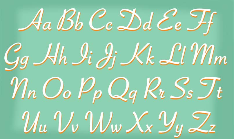
There are literally thousands of fonts. There are fonts that come with your standard software packages. There are fonts you can purchase. Fonts you can create. If BoxUp doesn’t have the font you want to use, you can save your font as an art element and import it into the design editor. There are practical font concerns if shipping, specifically ADA guidelines and USPS/parcel guidance on readability. If you’re packaging food, the FDA has its rules. For a deeper look on font selection, visit this page.
Now, you’re hopefully feeling comfortable with some basic principles and ideas relative to printing a custom box that reads well and looks great. As the premier platform for online, DIY design for custom-printed packaging, BoxUp’s team is here to help you get the perfect shipping box for your goods. Chat with one of our specialists or drop us an email if you have a specific question.

