Part of the appeal of subscribing to a subscription box service is how the products are presented. Unique boxes enhance the customer’s experience and further promote the brand. You already know how important the unboxing experience is to your customer, so you probably have spent hours thinking about the design and style of your box, your logo, font, and colors. But what about the inside of the box? You probably haven’t given nearly as much thought to that, yet it is just as important in adding to the customer’s experience.
Custom Printed Subscription Boxes for Personalized Customer Experience
A custom designed box shows the customer that you are invested in your brand. While the box serves a practical purpose of delivering the products, it can also enhance those products. The packaging that you choose when you create a subscription box can be as simple or ornate as you like, just as long as you stay within your brand’s message. Consider how customer will feel when they open the box or package and how the products inside are presented to them. Customers appreciate thoughtful design and aesthetics.

Leave No Stone Unturned
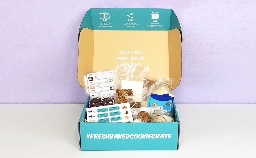
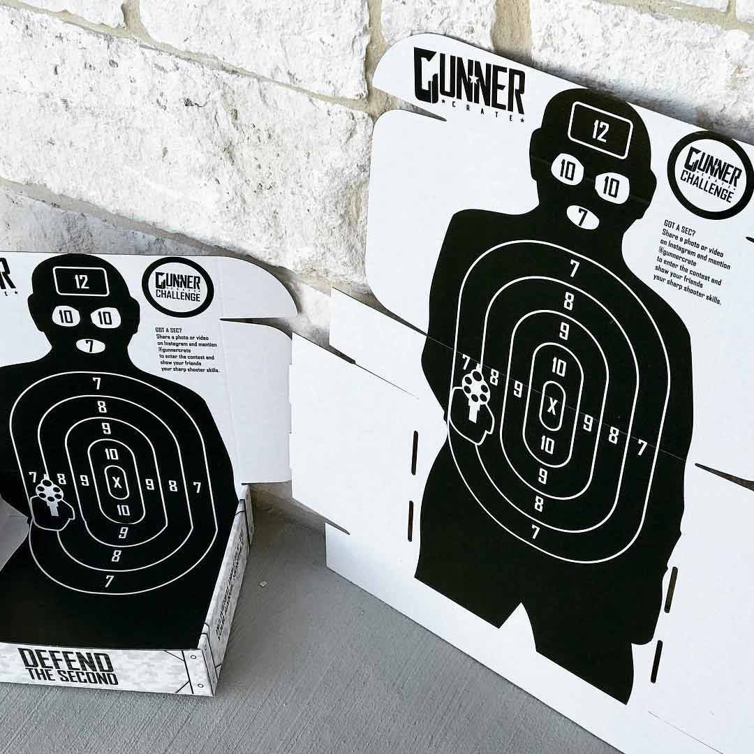
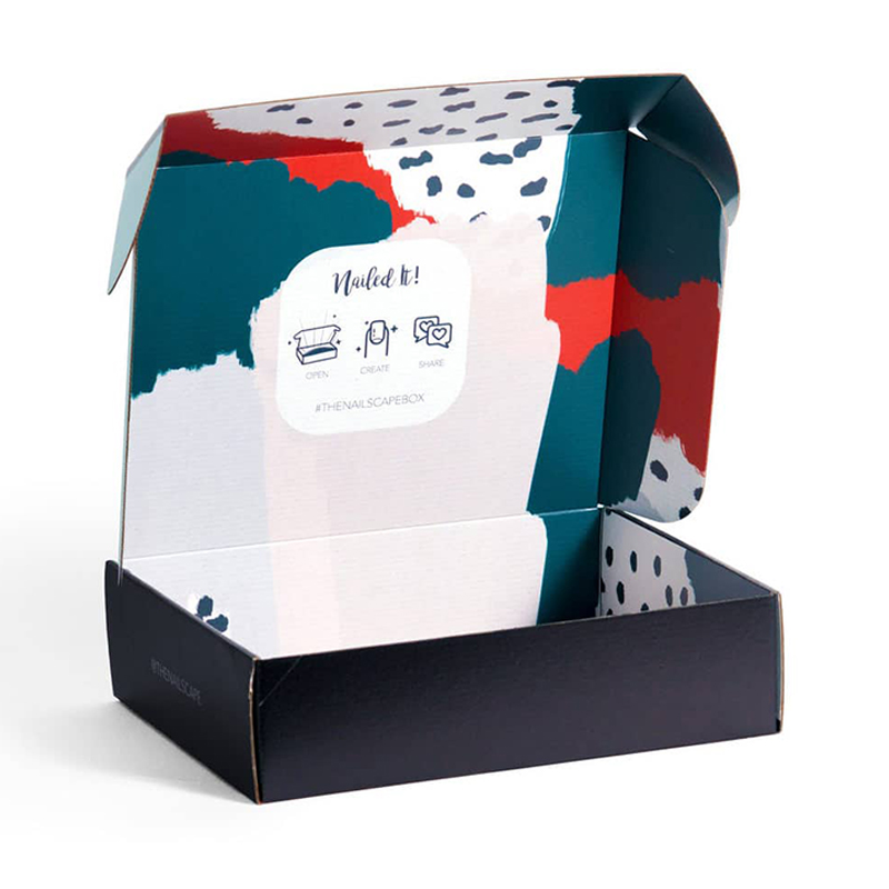
While most subscription box start-ups concentrate on the outside design of the box, the inside of the box should not be ignored. Most subscription box companies use e-flute fold up cardboard boxes, which provides an opportunity to print on the inside of that box. Think of it as more free marketing and advertising space to further promote your brand and make it more memorable. In fact, if you choose not to utilize the inside of the mailer box, you have missed an opportunity to reach the customer in another way – without increasing shipping costs!
Prime Real Estate
The inside of a customized box provides prime real estate in terms of getting the customer’s attention. After all, they must look at the inside of the box when they open it to see the contents. The inside printed design should stay consistent with your brand image by using the same colors, design, style, or logo. This creates a cohesive branding and marketing strategy that will hit home with the customer and contribute to the unboxing experience. This will also heighten the customer’s awareness of
the brand and contribute to a positive feeling about it.

The inside of the box design extends beyond the box top. Many subscription box businesses use custom printed exterior packaging as well as personalized interior packaging. A customized subscription box can be made with die-cut interiors or trays to display certain products and keep them from moving around. Don’t forget that the interior sides of the box can be printed as well. Think about exactly what the customer will feel when opening the box while designing the inside of your subscription box.
Inside Custom Box Designing 101
When you use Boxup.com’s Flex Editor to design a subscription box, the option to design the ever-important inside is available as well. This is a chance to be creative and drive home your brand’s theme. Choose from printed patterns such as dots or stripes, shapes, decorative lines, images or your logo. The choices of design and color schemes are endless. Whatever you choose should be aligned with your brand, theme of the box, and your color scheme to stand out in the customer’s mind. If you choose not to design the inside, it will remain white, which may be a wasted marketing opportunity.
Design Inspiration for Inside the Box
Many subscription companies have successfully used to the inside of the box to further promote their brand, and you can draw inspiration from them for your own subscription box. It can be as simple as Dollar Shave Club, who uses their logo of two crossed razors on the inside of each box top. Fab Fit Fun uses the inside of their mailing boxes to display colorful images with their logo front and center, portraying their reputation as an upbeat, positive vibe. Cairn, an outdoors subscription box, has a map with the saying, “The Outdoors Isn’t Going to Explore Itself”. Each of these are small reminders of the company’s brand and message they want to send to the customer.
Your subscription box should include a coordinated color palette, design, and imagery that extends to the interior of the box as well to further market to the customer and create a cohesive brand experience.

